Оригинал бы взят тут: https://nikolaus.by/blog/poleznye-fishki-dlya-sayta/mobilnoe-menyu-dlya-sayta-na-css-i-jquery/
class my_walker_nav_menu extends Walker_Nav_Menu {

	public function start_lvl( &$output, $depth = 0, $args = null ) {
		if ( isset( $args->item_spacing ) && 'discard' === $args->item_spacing ) {
			$t = '';
			$n = '';
		} else {
			$t = "\t";
			$n = "\n";
		}
		$indent = str_repeat( $t, $depth );

		// Default class.
		$classes = array( 'sub-menu' );

		/**
		 * Filters the CSS class(es) applied to a menu list element.
		 *
		 * @since 4.8.0
		 *
		 * @param string[] $classes Array of the CSS classes that are applied to the menu `<ul>` element.
		 * @param stdClass $args    An object of `wp_nav_menu()` arguments.
		 * @param int      $depth   Depth of menu item. Used for padding.
		 */
		$class_names = implode( ' ', apply_filters( 'nav_menu_submenu_css_class', $classes, $args, $depth ) );
		$class_names = $class_names ? ' class="' . esc_attr( $class_names ) . '"' : '';

		$output .= "{$n}{$indent}<ul$class_names><li><a href=\"#\" class=\"back\"></a></li>{$n}";
		// Вот тут было обязательно нужно <li><a href=\"#\" class=\"back\"></a></li>
	}


	// add main/sub classes to li's and links
	public function start_el( &$output, $item, $depth = 0, $args = array(), $id = 0 ) {
		global $wp_query;
		$indent = ( $depth > 0 ? str_repeat( "\t", $depth ) : '' ); // code indent

		// depth dependent classes
		$depth_classes = array(
			( $depth == 0 ? 'main-menu-item' : 'sub-menu-item' ),
			( $depth >=2 ? 'sub-sub-menu-item' : '' ),
			( $depth % 2 ? 'menu-item-odd' : 'menu-item-even' ),
			'menu-item-depth-' . $depth
		);
		$depth_class_names = esc_attr( implode( ' ', $depth_classes ) );

		// passed classes
		$classes = empty( $item->classes ) ? array() : (array) $item->classes;
		$class_names = esc_attr( implode( ' ', apply_filters( 'nav_menu_css_class', array_filter( $classes ), $item ) ) );

		// Вот тут нужно добавление класса parent для ссылок
		$t='';
		if(in_array("menu-item-has-children", $classes)){
			$t = 'parent';
			//if($depth != 0)
			//    $back_item = '<li><a href="#" class="back"></a></li>';
		}

		// build html
		$output .= $indent . $back_item. '<li id="nav-menu-item-'. $item->ID . '" class="' . $depth_class_names . ' ' . $class_names . '">';

		// link attributes
		$attributes  = ! empty( $item->attr_title ) ? ' title="'  . esc_attr( $item->attr_title ) .'"' : '';
		$attributes .= ! empty( $item->target )     ? ' target="' . esc_attr( $item->target     ) .'"' : '';
		$attributes .= ! empty( $item->xfn )        ? ' rel="'    . esc_attr( $item->xfn        ) .'"' : '';
		$attributes .= ! empty( $item->url )        ? ' href="'   . esc_attr( $item->url        ) .'"' : '';

		// Добавляем тут класс parent, если он родительский
		$attributes .= ' class="menu-link '. $t . ( $depth > 0 ? ' sub-menu-link' : ' main-menu-link' ) . '"';


		$item_output = sprintf( '%1$s<a%2$s>%3$s%4$s%5$s</a>%6$s',
			$args->before,
			$attributes,
			$args->link_before,
			apply_filters( 'the_title', $item->title, $item->ID ),
			$args->link_after,
			$args->after
		);

		// build html
		$output .= apply_filters( 'walker_nav_menu_start_el', $item_output, $item, $depth, $args );
	}
}

// Выводим на фронте вот эту часть
$origmenu = wp_nav_menu(
	array(
		'theme_location' => 'header_menu',
		'menu' => 'Menu 1',
		'items_wrap' => '<ul id="%1$s" class="%2$s">%3$s</ul>',
		'container' => '',
		'link_before' => '',
		'link_after' => '',
		'echo' => 0,
		'walker'  => new my_walker_nav_menu
	)
);
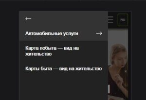
<div class="mobile_menu_container">
	<div class="mobile_menu_content">
		<?php echo $origmenu; ?>
	</div>
</div>
<div class="mobile_menu_overlay"></div>
$(function() {
	$(document).on("click", ".mobile_menu_container .parent", function(e) {
		e.preventDefault(), $(".mobile_menu_container .activity").removeClass("activity"), $(this).siblings("ul").addClass("loaded").addClass("activity")
	}), $(document).on("click", ".mobile_menu_container .back", function(e) {
		e.preventDefault(), $(".mobile_menu_container .activity").removeClass("activity"), $(this).parent().parent().removeClass("loaded"), $(this).parent().parent().parent().parent().addClass("activity")
	}), $(document).on("click", ".mobile_menu", function(e) {
		$(this).toggleClass("opened"),console.log('1111'),
		e.preventDefault(), $(".mobile_menu_container").addClass("loaded"), $(".mobile_menu_overlay").fadeIn()
	}), $(document).on("click", ".mobile_menu_overlay", function(e) {
		$('.mobile_menu').toggleClass("opened"),
		$(".mobile_menu_container").removeClass("loaded"), $(this).fadeOut(function() {
			$(".mobile_menu_container .loaded").removeClass("loaded"), $(".mobile_menu_container .activity").removeClass("activity")
		})
	})
});
.mobile_menu {
display: none;
}
@media screen and (max-width: 768px){
.mobile_menu {
display: block;
width: 30px;
height: 22px;
position: relative;
}
.mobile_menu span{
position: absolute;
left: 0;
width: 100%;
height: 2px;
background: #fff;
-webkit-transition: all .3s ease-in-out;
transition: all .3s ease-in-out;
-o-transition: all .3s ease-in-out;
-ms-transition: all .3s ease-in-out;
-moz-transition: all .3s ease-in-out;
}
.mobile_menu span:nth-child(2)::before {
content: »;
display: block;
width: 0;
height: 100%;
background: #fff;
position: absolute;
top: 50%;
left: 50%;
-ms-transform: translateX(-50%) translateY(-50%);
-webkit-transform: translateX(-50%) translateY(-50%);
transform: translateX(-50%) translateY(-50%);
-webkit-transition: all .3s ease-in-out;
transition: all .3s ease-in-out;
-o-transition: all .3s ease-in-out;
-ms-transition: all .3s ease-in-out;
-moz-transition: all .3s ease-in-out;
}
.mobile_menu span:nth-child(2) {
top: 50%;
-ms-transform: translateY(-50%);
-webkit-transform: translateY(-50%);
transform: translateY(-50%);
}
.mobile_menu span:first-child{
top: 0;
}
.mobile_menu span:last-child {
bottom: 0;
}
.mobile_menu.opened span:first-child {
top: -10px;
left: 10px;
opacity: 0;
}
.mobile_menu.opened span:nth-child(2) {
-ms-transform: translateY(-50%) rotate(45deg);
-webkit-transform: translateY(-50%) rotate(45deg);
transform: translateY(-50%) rotate(45deg);
}
.mobile_menu.opened span:last-child {
bottom: -10px;
left: -10px;
opacity: 0;
}
.mobile_menu.opened span:nth-child(2) {
-ms-transform: translateY(-50%) rotate(45deg);
-webkit-transform: translateY(-50%) rotate(45deg);
transform: translateY(-50%) rotate(45deg);
}
.mobile_menu.opened span:nth-child(2)::before {
width: 100%;
-ms-transform: translateX(-50%) translateY(-50%) rotate(-90deg);
-webkit-transform: translateX(-50%) translateY(-50%) rotate(-90deg);
transform: translateX(-50%) translateY(-50%) rotate(-90deg);
}
}
.mobile_menu_overlay,
.mobile_menu_container {
position: fixed;
top: 0;
left: 0;
width: 100%;
height: 100%
}
.mobile_menu_container,
.mobile_menu_container ul li ul {
-webkit-transition: all 200ms;
-moz-transition: all 200ms;
transition: all 200ms
}
.mobile_menu_overlay {
display: none;
cursor: pointer;
z-index: 10200;
background: rgba(0, 0, 0, 0.5)
}
.mobile_menu_container {
-webkit-transform: translateX(-300px);
transform: translateX(-300px);
width: 300px;
overflow: hidden;
z-index: 10201;
background: #222
}
.mobile_menu_container.loaded {
-webkit-transform: translateX(0px);
transform: translateX(0px)
}
.mobile_menu_container .mobile_menu_content {
overflow: auto;
max-height: 100%;
padding-bottom: 30px
}
.mobile_menu_container ul {
margin: 0;
padding: 0
}
.mobile_menu_container ul li {
list-style: none
}
.mobile_menu_container ul li a {
display: block;
padding: 15px 20px;
line-height: 20px;
font-size: 16px;
background: #222;
color: #fff;
text-decoration: none;
font-weight: bold
}
.mobile_menu_container ul li a.parent {
padding-right: 50px;
background: #333 url(«../img/arrow_right.svg») right 20px center no-repeat;
/*background: #222 url(«../img/arrow_right.svg») right 20px center no-repeat;*/
background-size: 20px
}
.mobile_menu_container ul li a.parent:hover {
background: #333 url(«../img/arrow_right.svg») right 20px center no-repeat;
background-size: 20px
}
.mobile_menu_container ul li a.back {
padding-left: 50px;
background: #333 url(«../img/arrow_left.svg») left 20px center no-repeat;
background-size: 20px;
box-sizing: border-box;
min-height: 50px
}
.mobile_menu_container ul li a.back:hover {
background: #333 url(«../img/arrow_left.svg») left 20px center no-repeat;
background-size: 20px
}
.mobile_menu_container ul li a:hover {
background: #333
}
.mobile_menu_container ul li ul {
-webkit-transform: translateX(300px);
transform: translateX(300px);
position: absolute;
top: 0;
left: 0;
width: 100%;
height: 100%;
background: #222;
z-index: 2
}
.mobile_menu_container ul li ul.loaded {
-webkit-transform: translateX(0px);
transform: translateX(0px)
}
.mobile_menu_container ul li ul.activity {
overflow-y: auto;
overflow-x: hidden
}
@media (max-width: 320px) {
.mobile_menu_container {
width: 240px
}
}
[/css ]
 Оригинал бы взят тут: https://nikolaus.by/blog/poleznye-fishki-dlya-sayta/mobilnoe-menyu-dlya-sayta-na-css-i-jquery/